


Fact: You’ve fallen into the ‘Case Study Trap’.
You’ve assumed that a split test win for another website will be a win for you..
Unfortunately, that is not the case.
Case studies have their place, they are great for coming up with test ideas… but you must take all case studies with a grain of salt.
A win on one site may be a loss on yours.
We’ve all seen those tests that showcase how minor changes can make a major difference.
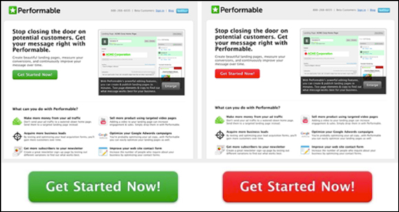
Source: Hubspot
In this example, the red button out performed the green button by 21%. Amazing, right?
Not really.
What are they measuring? What was the sample size? Can you really attribute this test to color theory like the analysis tried to or was this more of a case of visual dissonance highlighting the call to action?
Case studies like these promoting minor changes on elements that don’t really matter propagate an unrealistic expectation for split tests.
The problem is: Not enough marketers know what they should test on their site.
Let’s fix that.
Try testing this — NOT that…
Test This Element, Not That Element
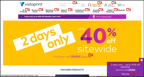
1. Call To Action (CTA), Not Button Color
Your CTA is one of the most influential pieces of copy on your page.
If you have a generic call to action this is a test you should absolutely run. CTAs that are more descriptive and action oriented appeal to visitors.
They know what to expect on the next page versus a standard ‘Submit’ or ‘Next’ button.
Button color tests are the lowest brow test in the book – they aren’t scalable and don’t provide any real insight. Essentially, you want your button to stand out – and color can help with that. Make your button stand out and move on – don’t harp on different hues of green.
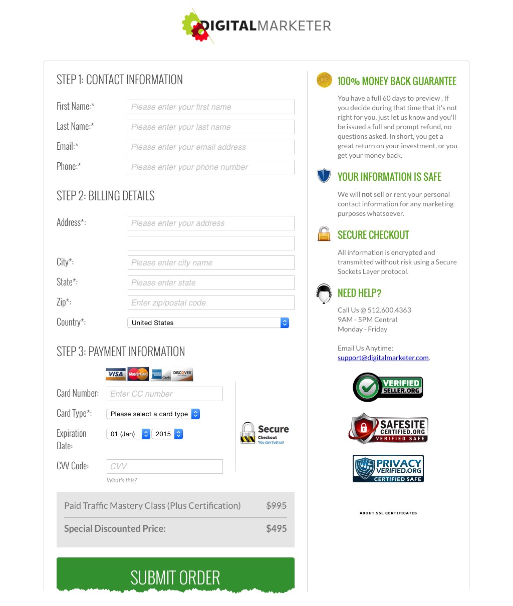
2. Form Fields, Not Form Placement
Should your form be on the right or the left?
It really doesn’t matter as long as someone can actually see and interact with your form. This isn’t a test you should run.
If you are worried about conversion rates on your opt–in forms, you need to identify if your form is noticeable. If it’s noticeable and people still aren’t converting – then it is time to start tweaking the form itself (not just moving it across the Y-axis).
Ask yourself…
- Can people see your form?
- Can they use it easily?
- Is the information you’re asking for reflective of what they are getting? (e.g. you aren’t asking them to fill out 20 form fields for a free checklist)
You need to identify what about your form is causing the friction and find the best way to neutralize it. There are a vast number of tests you can run on a form, and no single one is better than the other:
- Required vs. Optional Fields
- X Number Of Fields vs. Y Number of Fields
- Form Headline Test
- Form CTA Test
- Single Form vs. Multi Page Form
- Single Column vs. Dual Column
This list could go on forever, and there’s probably a case study out there showing a positive result for each contested variation.
Keeping all this in mind, testing the form itself will prove much more fruitful than testing the form’s location.
3. Your Offer, Not Your Layout
We always want to test a new landing page layout or give our site template a much-needed facelift.
However, it might not be your layout that’s causing your conversion problems – it’s probably your offer.
No amount of optimization can fix a bad offer, so if you haven’t evaluated this yet, you shouldn’t even start testing the more structural elements of your site.
These are just three examples of elements that are more ‘test worthy’. However, the elements that you test should be based on your visitor’s needs (I may sound like a broken record, but it’s THAT important).
For example, if you have a call to action that isn’t noticeable – then you shouldn’t be tweaking the CTA first.
Testing is highly contextual and there is no silver bullet for where to start, but the elements I’m suggesting to test are tightly connected to your unique selling proposition and conversion barriers. I’m confident if you start testing these elements rather than their counterparts, you’ll see much better results.
Test This Page, Not That Page
1. Search Results Not Search Boxes
If you have internal search, don’t focus on getting people to search – make sure that when they search they can find what they’re looking for and take action.
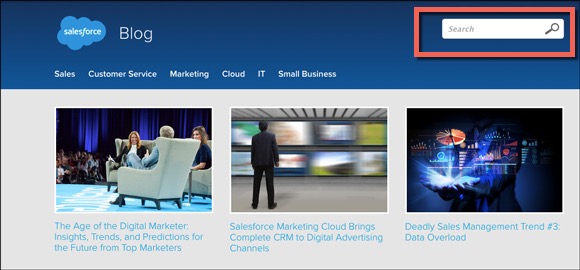
A visitor who searches for something is essentially saying that they couldn’t find what they were looking for on the page where they searched. In fact a study found that 73% of people will abandon a site when they can’t find what they’re looking for.
When your visitor is actually searching, make sure that the results are relevant and actionable.
Econsultancy found after digging into the search data of 21 sites, that on average when site search was used these visitors converted at 1.8 times the site’s average conversion rate. Simply put: visitors who search have buyer intent, so make it easy for them to buy.
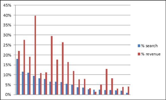
Source: Econsultancy
In this chart, Econsultancy shared the percentage of people using search and the percentage of revenues influenced by search from their study.
2. Product Pages, Not Homepage
The product page is a much better page to test than your homepage.
I get it, people like to test homepages because they get the most traffic. However, if you run a large site or a multi offer site, your homepage will have a lot of conflicting messages and CTAs.
What’s worse, homepages can actually be tough to test from an office politics standpoint.
Executives are married to their design, and by telling them to change it you might as well tell them their baby is ugly while you’re at it.
From a tracking perspective, there are all sorts of external variables that can impact the conversion path starting from the homepage. So when you run a ‘clean’ test you may actually draw incorrect conclusions when you dig deeper into the conversion path.
Product pages, on the other hand…
- Rarely hold the same emotional attachment from internal stakeholders
- Are closer to the deeper conversion activity
- And are focused on a singular offer
A product page test is much easier to run and will give you much cleaner data.
3. Cart Page (First), Not Any Top Funnel Page
Deep funnel pages like cart and Thank You pages should always take testing precedent if you haven’t tested before.
These pages are the closest to your conversion activity and your visitor has jumped through all your other hoops already – it’s time to reel them in.
Obviously, cart pages get much lower traffic than your top funnel pages, so some people may not be able to start here. However, if you have the traffic I’d highly recommend starting in your cart.
When you are testing in the cart, you’re not trying to convince people to buy anymore, their intention to buy shows interest. Your goal is to make the checkout process as simple as possible and ease any user anxiety.
What’s also great about cart tests is that they are directly connected to the sale, so it is much easier to turn your test metrics into the business-oriented metrics your boss/client will love.
If your goal is to increase sales (which it should be) then your cart is the first place to look for opportunity – not your homepage or other top funnel pages.
I’m a huge advocate for testing on pages that are tightly connected to business oriented conversion goals because I care about how my tests impact revenue and really don’t care about much more than that.
Yes, there is room for engagement tests, you need to get people to move down your funnel… but it’s our job to make more money with the assets we already have and you don’t make more money with engagement metrics.
These are the elements that you need to be testing – if you were planning to start a new testing campaign on something other than these pages or elements, I hope you’d reconsider!
Happy Testing!
Have a question?
Ask the DM team and 9,036 other members in the DM Engage Facebook Group!
Not a DM Lab Member? Learn more here.