
There are no silver bullets.
The Internet is full of tipsters offering lists of so-called “secrets” to boost your website’s visibility and conversions. While these generic tips sound great, they’re not universally applicable. Every site is unique, and there’s no one format that always works.
For instance, many bloggers assert that button color determines the likelihood of a user clicking it, so we decided to test this theory.
Take a look at the three buttons below. Which do you think got the most signups?
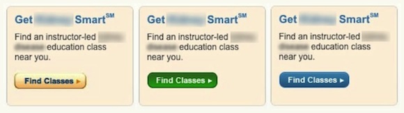
Any time I show this example at a conference, the majority of the audience picks green, which confirms what many popular blog posts say. While there are good reasons to consider green, those serial advisors are ignoring context.
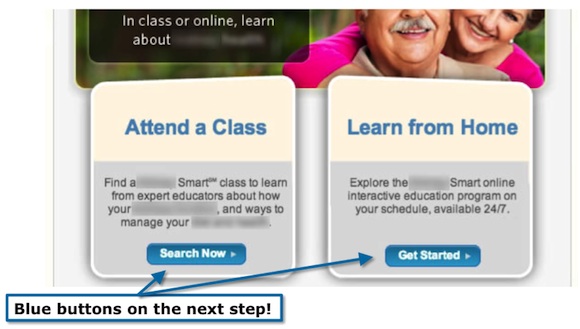
The buttons in the next step used a blue design.
The green button certainly stood out in the previous step, but in the wrong way. It was out of context, and it lost the “scent trail” for visitors. In the end, it didn’t perform as well as the blue button. Holistic considerations — the context, in other words — proved to be more valuable than “secrets.”
Don’t waste your time scrolling through blog posts about which call-to-action button color is most appealing, or any other “guaranteed winning tip.”
Instead, focus on the methodology behind these tips to determine what works best for your brand, and focus on these six factors that truly determine your site’s conversion rate.
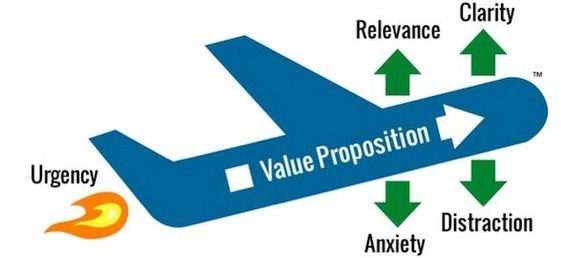
It’s called the L.I.F.T. Model for Marketing Optimization,
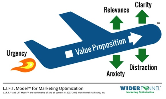
1. Establish Your Value Proposition
Your company must provide value to customers for them to give you their money.
The value proposition is the single most important factor to conversion, yet it’s often overlooked by businesses. This is a huge mistake because every other factor that contributes to conversion either supports or detracts from this value.
Before you ever open for business, you must create a clear value proposition for your brand and learn how to communicate it.
2. Provide Relevant Content
Does each landing page relate to what the visitor thought he was going to see?
If I click on a link expecting a video about basketball and get a blog about robots, I’m not going to suddenly develop an interest in robots.
I’ll just move on.
Your page needs to use the terms and imagery your visitors expect when clicking on the link.
3. Create Clarity
Marketers often have trouble articulating the exact message they want to convey and miss out on providing a relevant call to action. Well-executed design and content are key components to communicating your message.
When a customer lands on your website, the visual flow of the text and images should be easy to digest and comprehend.
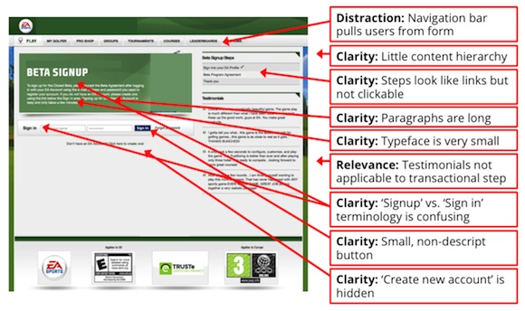
Here’s a page we worked on for a recent beta test for EA Sports.
After running this page through the L.I.F.T. methodology we found that the page is distracting and lacks clarity.
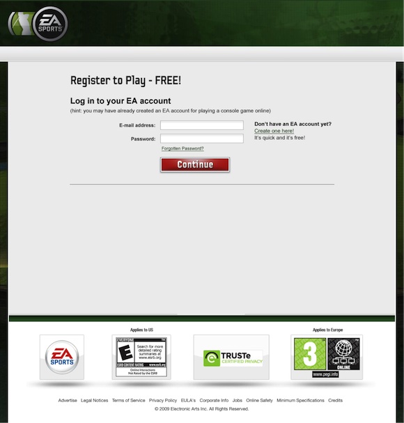
After several rounds of testing, we provided gamers with the imagery they’re used to engaging with online.
This redesign led to a 12.8 percent conversion rate lift and propelled the team to a winning game launch.
4. Establish Urgency
It’s difficult to determine the internal urgency of a customer without asking (which you can’t always do).
Whether a customer is looking to buy immediately or just browsing isn’t something you can control, but you can present content in a way that subtly nudges a visitor with an external element of urgency.
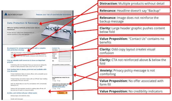
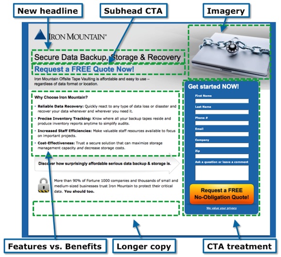
We ran this landing page from Iron Mountain through the L.I.F.T. methodology and made notes. Iron Mountain is the world’s leading data backup, protection, and recovery service.
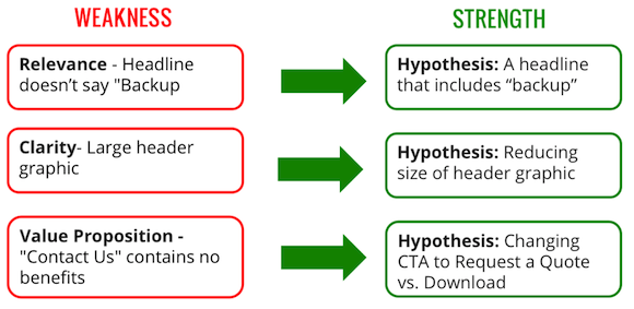
WiderFunnel created various hypotheses to turn these weaknesses into strengths:
After multiple rounds of rigorous testing, we finally refined the page to create a sense of urgency that fits with the Iron Mountain brand and connects to its corporate clients. This new Iron Mountain landing page design increased its conversion rate by 400 percent. (Yes, that’s four times the original conversion rate!)
5. Reduce Anxiety
Credibility is critical.
The more credibility you have with a visitor, the less anxious he’ll be about completing your call to action. When you’re first starting out, easing a customer’s anxiety is difficult, but a well-executed page that both looks and functions professionally goes a long way toward separating you from the competition.
Anxiety is provoked by anything on the page — or missing from the page — that creates uncertainty in the visitor’s mind about completing the call to action.
In the Iron Mountain example above, the daunting privacy policy message was likely contributing to anxiety for people filling out the lead capture form. In the winning test variation, we changed the message to “We value your privacy” to reduce the sense of anxiety.
6. Minimize Distractions
Remember Myspace and GeoCities? There’s a reason Google won the search wars back when the Internet looked like Times Square and the Las Vegas Strip combined.
It’s natural to want to squeeze as much content as possible into each page, but when you give your visitors too much to process or present them with too many options, it becomes easier to leave and choose none. Follow Google’s lead with a clean, minimalist design.
We’re all aware of Internet best practices, but anyone who tells you that they have the end-all, be-all guide to building the Venus flytrap of websites is making you an empty promise.
Instead of relying on some magic formula promising the hidden glory of button color and positioning, follow the L.I.F.T. framework to develop hypotheses that can be rigorously tested and refined until you know you have the design that will bring you the highest conversion rate.
How to apply L.I.F.T. to your business
Open up one of your landing pages and view it with fresh eyes — applying the L.I.F.T. model.
Look for weaknesses in any of the following areas:
- Value Proposition
- Relevance
- Clarity
- Urgency
- Anxiety
- Distractions
For example, I just did an arbitrary Google search for a well-known product: “printer supplies.”
Here’s the Google AdWords ad I clicked on…
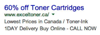
This ad carries a compelling message, promising 60 percent off toner cartridges, which was great until I hit the landing page.
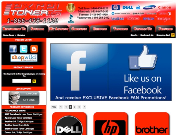
That’s quite an eyeful.
There are too many problems on this page to count them all, but I’ll touch on a few, some of which you may recognize on your own website:
- Distraction: An overwhelming initial impression of saturated colors and design elements likely discourages visitors from even attempting to understand the content. Worse, an automatically rotating message carousel has been shown to reduce conversion rates in most tests we’ve run (especially when the messages being rotated aren’t relevant!).
- Anxiety: The dated graphic design is seriously reducing the company’s credibility. Furthermore, having the live chat offline in the middle of the workday is not a promising start to the company’s customer service promise.
- Clarity: The headline has gone missing.
- Relevance: There’s no mention of the pay-per-click “60 percent off” message. And there’s a disproportionate emphasis on Facebook; the primary message is missing the entire value proposition of this company. Their visitors aren’t there to “like” them on Facebook. They’re there to get printer supplies!
- Distraction: The red-and-black combination creates visual confusion. The red-on-red logos of both the company and printer brands have no contrast, and the gradient background treatment adds to the visual confusion.
That one may have been easy to critique, but I picked at random from the search results and landed on it first. The reality is, even for websites that have a better starting point, there are always improvements to be made.
It’s simple…
Step 1: Run your landing page through the L.I.F.T. model
Step 2: Identify weaknesses
Step 3: Create a testing hypothesis to fix the weakness
Step 4: Run the test
What questions do you have? Let’s talk about it in the comments section below.