


Have you been treating your landing pages as the favorite child while leaving your homepage locked in the downstairs closet as if it was your unwanted adopted nephew?
Just like Harry Potter, your homepage has magical powers. The problem is that it can’t show you those powers if you don’t give it the chance.
What if your landing page was bringing in sales faster than those Hogwarts acceptance letters flew into Harry’s home?
That’s the power of your homepage. You’re reading that right. We said homepage… not landing page.
Landing pages have gotten a lot of credit over the past few years. They’ve become the Dudley Dursley of the household. The favorite, even if they don’t always pull the most weight. We have nothing against landing pages, we love them and use them all the time.
The problem lies in the Zero Moment of Truth. That’s where your homepage becomes a necessity in closing the sale… yet few marketers know about this moment (and less use it strategically). The Zero Moment of Truth was discovered by Google and shows why even the best landing page needs a great homepage standing next to it.
Before we explain the Zero Moment of Truth, let’s teach you how to spot the difference between a landing page and a homepage in the wild.
Landing Page vs. Homepage
Landing pages and homepages have two different goals. That’s why they don’t look the same and why they have different names.
Landing pages are designed for action. On a landing page, you’re asking a visitor to do something. It could be to buy a product, opt-in to an email list, schedule a call, participate in a webinar, sign up for a free trial, etc. Your landing page centers around the goal of getting someone to take a single action.
Everything on your landing page is put there to strategically move someone closer to taking that action. On landing pages, you’re going to see lots of copy explaining the product (or lead magnet, webinar, etc.) and calling out the customer avatar.
Here’s our landing page for our Search Marketing Specialist Certification. This is just ¼ of the entire page (click here to see the entire page). Notice how much copy is on it? All of that copy centers around one action: Enroll Now.

Here are some telltale signs you’re looking at a landing page:
- It’s long (like you’re scrolling and scrolling and scrolling)
- There’s a lot of copy (the more words, the higher chance it’s a landing page)
- It talks about ONE thing (product, lead magnet, webinar, opt-in, etc.)
- Every button is for the same action (even if the copy slightly differs)
Homepages are different. Homepages aren’t pushing for action. You’ll definitely have call to action buttons on your homepage, but they’re not the main event. On your homepage, you’re looking to do more than just create action. The goal of your homepage is to clarify the benefit of your business, establish trust with the visitor, and point the way to what they can do next.
While landing pages are created to strategically move someone to taking action, your homepage has to do more than just that one job. Your homepage is telling brand new visitors who you are and what you do, why they should care about your business, and what they should do now.
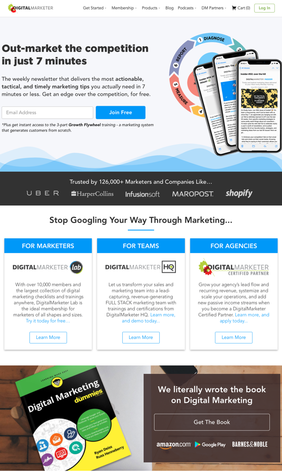
Here’s the DigitalMarketer homepage. This is about ¾ of the entire page (click this link to see the entire thing). Notice how little copy there is and how you can already see 5 different calls to action.
You’re looking at a homepage when:
- It takes you one or two scrolls to get to the bottom of the page
- You don’t see paragraph after paragraph of copy
- It talks about several products or mentions a few customer avatars
- There is more than one type of action being asked of the visitor
When we’re selling products, we always point people to landing pages. We don’t want to send hot leads to our homepage where they’ll have to make their way through several calls to action and menus to find the product they’re looking for.
So, why do homepages matter?
Thanks to Google research, we know why homepages are still relevant. It all comes down to the Zero Moment of Truth.
The Zero Moment of Truth
Even though it sounds like it came out of a futuristic TV show about space, the Zero Moment of Truth is relevant to you as you read this. You don’t need a spaceship to Mars to start using this in your marketing strategy.
What you need is an understanding of how humans buy online products. When someone reaches your product page, they’re in the First Moment of Truth. To get to the Zero Moment of Truth, they take a step backward.
Instead of clicking on that beautiful Buy Now button, they move their mouse North, find your menu, and click on your homepage.
Why?
For the same reason we have a homepage in the first place. This visitor is looking for clarification and to figure out if they trust you. After a quick scroll through your homepage to make sure you check out, they’ll head back to the product page and hit that Buy Now button.
Here’s Google’s video explaining the Zero Moment of Truth:
Your homepage is that last step a hot lead takes to make sure they know who they’re buying from. We’re so used to thinking of homepages as the first step, that we forget to create a homepage that clarifies who we are and establishes the trust these leads are looking for.
Most importantly—we have to do all of that in 7 seconds or less.
What Your Homepage Should Look Like
You’re one quick Google search away from swimming in homepage templates. Here’s the problem…how do you actually know that these templates work for YOUR business?
Founder and CEO of DigitalMarketer Ryan Deiss uses Homepage Lifecycles to show why all homepages are not equal. You should *not* be trying to replicate Apple’s homepage. You’re not in the same Lifecycle as them, and you’re going to confuse your visitors and they’re not going to get the trust they were looking for.
There are 4 Homepage Lifecycle Phases:
Phase 1: Problem Aware (the customer knows they have a problem)
Phase 2: Solution Aware (the customer is evaluating which solution is best for them)
Phase 3: Product Aware (people already know your product)
Phase 4: Most Aware (people know exactly what you sell and who you are)
You’re either in Phase 1 or Phase 2. (Apple is in Phase 4)
In Phase 1, your audience is looking to find hope on your homepage. They want to know that there is a solution to their problem.
In Phase 2, your audience needs clarity. They’re looking to see how you’re the right solution for them in comparison to the competition.
Oh yeah—you need to do all of this in 7-seconds or less.
Why 7 seconds?
That’s the attention span that we’re working with these days. Your audience isn’t going to give your website a full 60 second look through if they’re not feeling hopeful you can help them with their problem or clear you’re the best person for the job.
In 7 seconds or less, your homepage needs to answer these 3 questions:
#1: What is it?
#2: Why should I care?
#3: What now?
Here’s the template you’re going to use.
The High-Converting Homepage Template
These are the critical homepage elements you’ll need to create your high-converting homepage:
- Top Menu (logo, basic navigation, primary CTA)
- Headline/Sub-Headline
- Hero Shot/Supporting Imagery
- Call-to-action (Primary/Secondary)
- How It Works (steps, features/benefits, video, demo/walkthrough, etc.)
- Who It’s For (avatars and use cases)
- Trust Builders (customer logos, testimonials, customer stories, etc.)
- Footer (extended navigation, company info, legal notices, miscellaneous information)
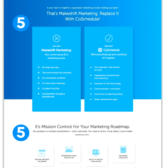
Using CoSchedule’s homepage as an example, you can see the first 4 elements labeled below:

Here’s their How It Works section:
Here is their call out for their customer avatar (Who It’s For):
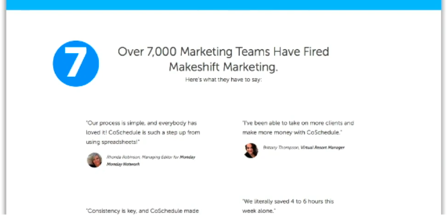
This is where they build the trust we talked about earlier with testimonials and social proof (“Over 7,000 Marketing Teams Have Fired Makeshift Marketing”):
And lastly, they have their footer:

Consider this your Pinterest inspo board for your homepage (you can also check out our homepage for more inspiration).
Let’s take a dive into each of these elements so you know you’re on the right track (we’re marketers—we live for efficiency).
#1: Top Menu
In the wise words of Ryan, “When it comes to your menu, less is more.” All you need are the bare essentials. You can add drop down menus, but make sure they’re still minimalist and don’t have too many options.
#2: Headline/Sub-Headline
The most daunting part of creating a homepage is your headline. It feels like the make or break and ends up getting more pressure than the dinner inside your InstaPot. Use these templates to find the one that best suits your avatar and offer and write a subheadline that connects the dots:
- Transform Your [Existing Asset] Into [Known Desired End Result]
- [Desired End Result] for [Avatar]
- We Help You [Featured Action] That [Achieve Desired End Result]
- Get Help [Market/Company Type] Get More Out of [Known Painful Action]
- Get More [Desired Result] From Your [Existing Asset], Starting Now
- Turn [Something they have or something that’s easy to get] Into [Known Desired End Result]
- Easily [End Result] with [Feature]
- Make Your [Constituent Group] Better/Better At [Meaningful Core Skill/Benefit]
- [Accomplish Desired End result] without [Known Roadblock or Bottleneck]
- Every can now [something simple] and [accomplish desired end result]
- Stop [Known Pain Point]. We’ll Do It For You.
- Tired of [Known Pain Point]? [Product Name] Makes It Easy to [Overcome Pain]
#3: Hero Shot/Supporting Imagery
This is a big one. Your hero shot is the primary image on your page. The best hero shot demonstrates the after state your customers experience thanks to your products/services. Avoid distracting, misaligned, or egotistical images (like a photo of your office building).
#4: Call-to-action (Primary/Secondary)
CTAs are all about clarification. Clarity shows confidence and makes it crystal clear what happens when someone clicks on your button. You want somebody to read your CTA and think, “Got it, once I click this [X] will happen.” Avoid CTAs like, “Get Started” because your visitors can’t figure out what happens when they ‘get started.’
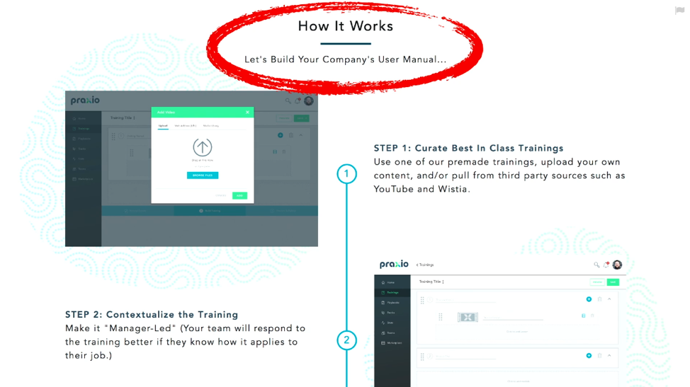
#5: How It Works
This is the next logical question someone asks after spending 7 seconds on your homepage. They know what it is, why they should care, and what to do now—but they’re wondering, how does this work? As tempting as it may be to create a clever headline, simple headlines like “How It Works” answers the question your visitor is asking.
#6: Who It’s For
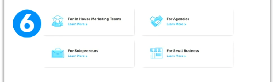
This is the part of your homepage that keeps explaining who your products are for. Your homepage has already made clear who your customer avatar is, but this section can be used to expand with more details. Here’s how the DigitalMarketer homepage details our 3 customer avatars:
#7: Trust Builders
Trust builders are essential for your homepage because of the Zero Moment of Truth. There are 4 categories that trust builders fall into:
- Media mentions
- Testimonials
- Customer Stories
- Integrations/Partners
#8: Footer
We’re going to pretend to be excited about this part of homepages, but let’s be serious. Your footer is like the vegetables you add to an unhealthy meal to pretend that you’re making a better dinner decision. Necessary for your health, but not the most exciting part of your plate.
Here’s a resource checklist of everything you want on your footer:
- Copyright statement
- Physical address
- Contact us
- Terms of Service
- Privacy Policy
- Expanded navigation
- Flagship content/case studies
- Links to social properties
You now know how to write not just any homepage—but a high-converting homepage.
It’s so tempting to think that we can put together one beautiful landing page and stare at it for the rest of our lives as it brings in sale after sale. The reality is, your audience is more dynamic than that. They’ve been on the internet for just as long as you.
They’ve ordered something only to find that it looks nothing like the product photos. They’ve felt disappointed by copy that mislead the services they paid for. It’s your homepages job to clarify that you know what their problem is and how to fix it, and they can trust you to come through.
Start building out your homepage and be one of the few companies that understand the importance of the Zero Moment of Truth, and how to use it to get more conversions on your landing pages.