


A few months back I showed you the power and ease of running copy tests.
If simple copy changes can drastically impact conversions and a picture is worth 1,000 words, then you should really take image testing seriously!
Today we’re going to discuss some image elements that are worth testing on your website, emails, and landing pages.
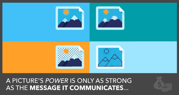
A word of caution: an image is only as powerful as the value it communicates.
Also I must remind you that when you test, you want to go after elements that are important to your visitors and develop tests that are based on clear research and not blind element implementation.
That said – if you noticed that your images aren’t working on your page, here are 5 elements to test…
1. Genuine Images vs. Stock Photography
I absolutely abhor stock photography.
We’ve all made the jokes (I mean who didn’t love Vince Vaughn’s take on stock photos — we even used one on our blog) and heard the different classifications, e.g., business porn.
The real problem with stock photos is they are not genuine. The smiling ‘customer service’ sales rep just looks cheesy and doesn’t help build trust with your customers.
Source: headsethotties.com
When we add elements to our website they need to do 3 things:
- provide clarity,
- reduce anxiety,
- or add a level of persuasion to your page.
In general stock photos do not help with any of these factors on your page.
Simply put, if you use stock photography you are not providing any new value to your customer with that image and you are lying to your customer.
Yes — I said lying….
Does that blonde sales rep work at your company? No.
Is the excited gentleman excited because of your product? No.
Customers associate genuineness with trust! If you aren’t being genuine at this stage, why on earth would they want to do business with you?
Here’s a test by Marketing Experiments that brings this point home:
Stock Photo Treatment:
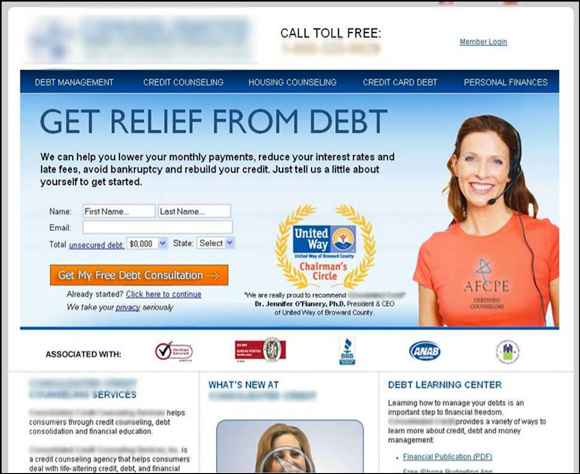
Photo of the Founder:
The photo of the founder increased sign up rates by 34.7% at a 95% confidence rate. The ambiguous model may have a certain aesthetic appeal, but it lacks any genuineness and ultimately depressed conversions.
I totally get why stock photography is used, it is a cheaper solution to genuine photography. Most companies don’t have a photo studio and it would be way too expensive to invest in one…I get it. However, you can totally make stock photos look more genuine with a good graphic designer.
I have more image elements to talk about, so if you want to read a really well written post that dives into stock vs. genuine photos check out this post by my friend Tommy Walker.
2. Product Shot vs. Product Use
This is an age old debate – should I show my product shots or the product in use?
Ideally you’d want to use both, but for some of our landing pages we have limited space and must prioritize the imagery on our site.
If you’ve noticed a drop in conversions on your page and have used a product shot ‘because that’s what you’ve always done’… it might be time to try showing some value.
In this case study, there was a shot of the industrial printer versus what a product looked like with the printed characters. The version of the printer ended up lifting form submits by 37.2%.
Product Shot:

Product In Use:

Defaulting to the can with the printed characters shows the final outcome of the product, but doesn’t showcase the printer itself. Further, when you just show the outcome, you don’t immediately know what you’re buying.
Is this a printing service or an actual thermal printer? This ambiguity can depress conversions, because the image does not communicate the right message.
How you showcase your products will impact how people interact with your site. So give this a try if you think your hero shots aren’t conveying the right message to your audience!
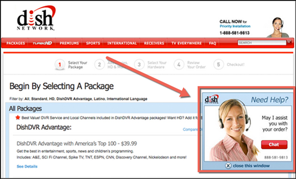
3. Including a Human
We are really good at identifying faces… like really good at this.
One great way to draw attention on your page is with a human face. However, you don’t want this to become an element that distracts from your main call to action (CTA).
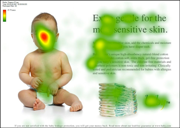
Source: AdMonkey
People spend the most time looking at this face and with much more attention!
If you haven’t added that human touch to your page and it actually provides value to the page, it might be time to test this out. Be warned, anything can happen!
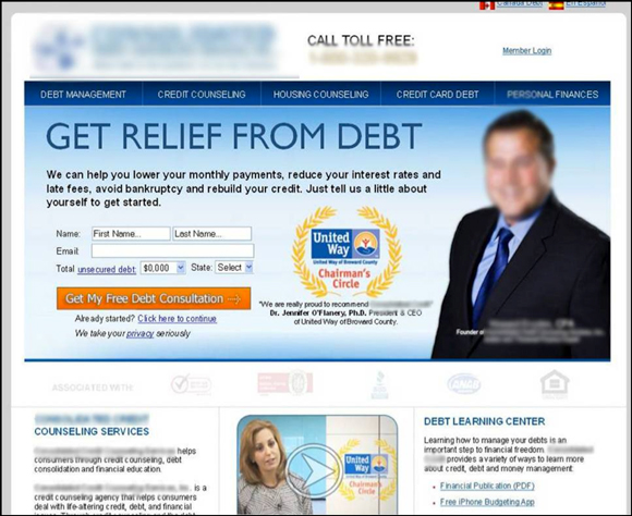
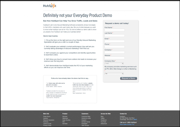
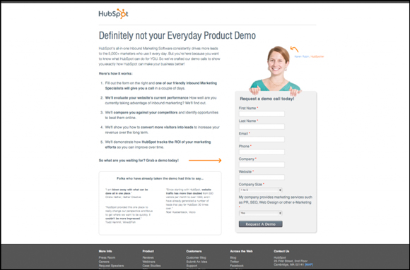
HubSpot was about to make the declaration — All landing pages require a picture with a staffer on our landing pages — but then they ran this test.
Without a Human:
With a Human:
Source: Unbounce
The version without the HubSpot staffer increased leads by 24%. So had they not run this test, they would have been leaving leads on the table!
With the traffic HubSpot has, that would have been a major loss caused by blind adoption of best practices.
4. Clickable Images
People love clicking images…
…even when they aren’t clickable!
In general there is a lost opportunity here, especially if your image is both related to and in close proximity to your CTA.
Make your images work for you! One thing we do at Digital Marketer is add javascript alerts to images that aren’t directly related to the CTA but are clicked often.

When someone interacts with a page and something they expected to happen doesn’t happen, they get frustrated.
Frustrated visitors don’t convert, so acknowledge their action and move on.
This type of image tweak is really more of a functional change. Maybe you have an image getting clicks that doesn’t link anywhere. This is what I call a missed opportunity, and can actually help drastically increase conversions if you just add that link to the image.
In fact, we had this very problem – and by just adding a link to an image on our page we increased lab sales by 40.7%.
5. Image Placement
We talked about the importance of conveying a message with your images, but what good is conveying a message if no one sees the darn thing!?
Image placement can make or break your page. Here are a few guidelines to consider when you’re evaluating whether your image is in an optimal location.
First:
Use Crazyegg or HotJar to get a heat map report of your page.
Second:
Ask these questions:
- Do people see your image?
- If it’s below the fold, what percentage of people actually scroll that far?
- Is my image competing with other more important elements, e.g., persuasive copy, CTA, etc…
How you answer these questions will give you a good idea of where to place your image.
A lot of web users have been trained to expect certain elements in certain places. I don’t want you to reinvent the wheel here, but if you notice your images aren’t being seen and they communicate value well, it’s about time to test different image locations.
Image Location Left:

Image Location Right:

Source: Quicksprout
This case study tried breaking the mold here and moved the opt-in form to the left hand side with its challenger variation. In this example the form on the right hand side surprisingly lifted conversion rates by 11%.
Sure this page looks quite odd and goes against major best practices (especially since responsive web design has become the norm), but this variation trumped standard best practices.
Would I recommend moving all your forms to the left or spitting in the face of all best practices? Absolutely not!
However, examples like this do give good reason to dig into your data and make sure that your page layout is actually working for you and not against you.
Images are an extremely important element in your email campaigns, landing pages, and websites. However, a picture’s power is only as strong as the message it communicates. So before you try any of these image element tests ask this very important question:
Does my current image convey the message that is consistent with this page’s goal?
If yes, look at other elements.
If no, it’s time to grab your camera and get some new images to test.
Have a question?
Ask the DM team and 9,036 other members in the DM Engage Facebook Group!
Happy Optimizing!