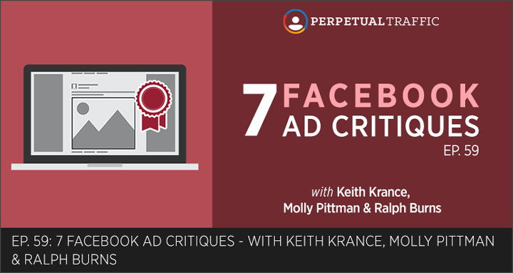
Fine tune your ad writing skills as the Perpetual Traffic crew reviews ad copy from businesses making education, SaaS, and ecommerce offers on the Facebook ad platform. Keith, Molly, and Ralph reveal what works and what doesn’t with the hooks, headlines, and calls to action of these ads.
Find the images of each ad mentioned in this episode in the Resources section and the podcast transcript.
IN THIS EPISODE YOU’LL LEARN:
- How Concordia University uses a great “hook” and “copy specificity” to sell women on going back to school.
- A classic ad copy formula (used by SaaS company, SamCart) you can apply to virtually any market.
- How Zenreach uses ad copy to drive video ad consumption (and the simple tweak that would likely improve performance).
- Plus, we’ll warn you of a recent change with the Facebook Ads manager and Power Editor that may be affecting ads you’re already running.
LINKS AND RESOURCES MENTIONED IN THIS EPISODE:
Canva – Build beautiful Facebook ad images, effortlessly.
Zenreach – See the video ad Keith critiques on the Zenreach home page.
Episode 59 Transcript (swipe the PDF version here):
| Keith Krance: | Welcome to Episode Number 59 of Perpetual Traffic. We’ve got Ralph, Molly, and myself on, how are you guys doing today?
|
| Ralph Burns: | All right.
|
| Molly Pittman: | Awesome.
|
| Keith Krance: | Good stuff. We’re coming towards the end of summer. A lot of us are in industries probably where August is a slow month. Just remember, after Labor Day things pick-up in a big way, unless you’re selling get back to school gear, or golf training or something like that, you’re probably having a down time right now; that’s just going to be seasonal. Now’s a great time to start figuring out high-level strategy and working on ad copy, which is the topic of today. It’s a good time to be looking through your accounts and really getting ready for next month, because that’s when all of a sudden people wake up. People just disconnect in August, the masses in general do. Even if you’re not disconnected, a majority of your customers are. That’s okay, but right now it’s a good time to plan and create some good creative.
|
| Today, all three of us recorded our own version of a little mini-ad critique. We’re going to be walking you through some ads, and why we like them in different industries. Then, you can head over to the show notes at digitalmarketer.com/podcast and go through each of these critiques that we talk about; we’re going to have screenshots you can look at.
|
|
| First of all, before we do that, really quick, Facebook update news: There’s been a recent frustrating update with the Facebook Ads Manager. Basically, Facebook has decided to go in there and change one setting that could have affected your ads that are already running. Also, something to be aware of if you’re creating any new campaigns in the future and that is the placements and the ads set level. Facebook has changed it to where the default setting for your placements is going to be desktop right column or desktop newsfeed or mobile newsfeed. The way that Facebook has done this now is they have automatic placements, and they have it as recommended, that’s the default.
|
|
| They automatically set it for you. You’re going to be showing your ad in newsfeed on Facebook, right column on Facebook, mobile on Facebook, and in Instagram, and in the audience network. It’s a bummer because that’s not what we recommend. What we recommend is to focus on Facebook and hold off on Instagram and audience network until you get some data. Maybe you start out in all placements on Facebook, but you might be in a situation where you’re separating mobile from desktop. You might have ads running right now where they automatically turned on desktop, even if you had it turned off. Right, Ralph? That’s happened in some recent campaigns.
|
|
| Ralph Burns: | Unfortunately, yes. That kind of screwed stuff up, which really has caused a big pain for us the last couple of days. We tend to separate out desktop, newsfeed, mobile newsfeed, and right-hand column, then we usually reserve Instagram or audience network in specific cases. But Facebook has now updated, yet again, the ads manager and the power editor, which is where we create most of our ads. Definitely, do not take the recommended route from Facebook in this case. In most cases we say, “Do what Facebook tells you to do,” but in this case we say, “Don’t do what Facebook tells you to do, because your traffic is going to be defused across all these different networks and you lose a lot of control.”
|
| At the very least, click “edit placements” and then go into “all devices.” You can specifically pick which part of Facebook you want to run your ad in, whether it’s mobile, desktop, right-hand column. Then, if you want to run in Instagram or if you want to run in the audience network, we typically de-select those when we start off. The update has caused some changes and some havoc here, but just moving forward, make sure you do that whenever you create any new ads–check that section.
|
|
| Keith Krance: | Cool. What we did for this episode is each one of us recorded our own mini-ad critique. We’re going to let Molly kick it off. It’ll go Molly, Ralph, then Keith. Just remember, you can go back to digitalmarketer.com/podcast and checkout all the screenshots of the ads as we go through them. I hope you enjoy this podcast.
|
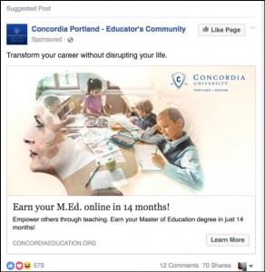
| Molly Pittman: | Okay, guys. First, I’m going to critique an ad from Concordia University, and talk about what I like and what I don’t like about this ad.
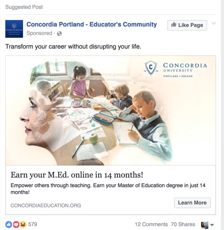
First of all, I really like the newsfeed copy here, the copy at the top of the ad that says, “Transform your career without disrupting your life.” If you look at the image, it has the silhouette of a woman with a family in the background, which I think is really powerful, because it’s really portraying this marketing message of transform your career without totally disrupting your life—without disrupting your home life, without taking away any time from your children—I think they did a really good job here of overcoming doubt that someone might have. For a woman who’s in her middle ages and not really in the age range to be in a traditional college, this ad really makes sense.
|
| Again, I think it’s because they’re using this hook “Transform your career without disrupting your life” and the image is really portraying this idea that this woman is thinking about her kids and that this university isn’t going to interfere with her home life. That she can still accomplish her goals, without having to compromise her life at home. The headline below that is “Earn your M.Ed. online in 14 months!” Again, I really like how they’re focusing on this isn’t disrupting your life, this is an online course, and it only takes 14 months. Any time you can use specificity in copy in terms of numbers, that’s great. Below that you see, “Empower others through teaching. Earn your Master of Education degree in just 14 months!” They’re using the last line of copy to really reinforce the rest of the ad.
|
|
| But if I were to change anything about this ad, I would’ve added some more copy to that top line, “Transform your career without disrupting your life.” I think it’s great to use a tag line, but I also think that sometimes people don’t make the connection. I would’ve added a line of copy that said something to the effect of, “Are you wanting to go back to school, but worried that’ll interfere with your home life? Transform your career without disrupting your life with Concordia!” I would’ve added a bit of extra copy there to really hit at that pain point for people that aren’t reading too much into these ads. Overall, I really love this ad.
|
|
| They really did a good job of understanding their avatar, understanding what barriers they’re going to have to overcome to really sell this idea of going back to school to a middle age woman.
|
|
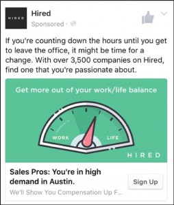
| The second one I want to critique is from Hired.com.
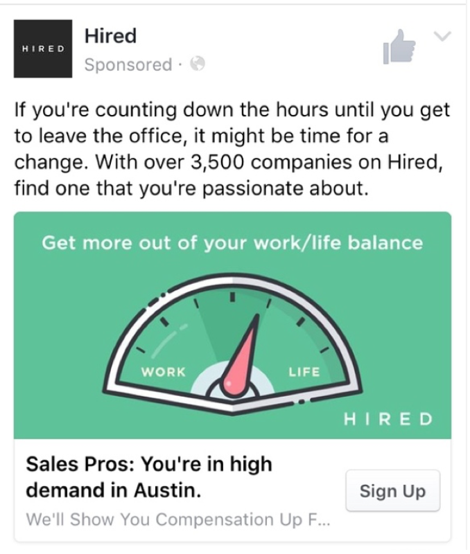
The copy at the top says, “If you’re counting down the hours until you get to leave the office, it might be time for a change. With over 3,500 companies on Hired, find one that you’re passionate about.” This copy is really telling a story. Anyone with this particular pain point that’s working in an office, that doesn’t like their job, that’s bored with their job, that hates sitting at a desk all day, they’re going to relate to this copy; it’s a wonderful copy. “If you’re counting down the hours until you get to leave the office, it might be time for a change.” I think that a lot of people can relate to that. Luckily for Hired, they’re hitting that pain point and then they’re saying—Hey, the solution is our product. We have over 3,500 companies. Again, using a number for specificity there is really powerful.
|
|
| The headline at the bottom says, “Sales Pros: You’re in high demand in Austin.” It looks like they were doing some job title targeting here, that’s probably why I saw this ad. Using the actual city name in the ad was great, really calling out that audience, making people realize that this ad was written specifically for them. I really love that part of the ad. Then the image is wonderful. It has copy that says, “Get more out of your work/life balance.” It’s a nice green color that really stands out in the newsfeed, but it has a gauge with “work” on one side and on the other side is “life.” The gauge is starting to tick towards the side that says “life.” Again, they’re doing a wonderful job of portraying the marketing message here, because you could scroll through your newsfeed and look at the image and immediately know what this ad is about.
|
|
| If you have the pain point of wanting a better work/life balance, this image would absolutely catch your attention. I hope you found these critiques helpful.
|
|
| Ralph Burns: | Hey, this is Ralph. For my ad critiques, I’ve got two that I really like that we picked out of dozens, but I narrowed it down to these two. Then I’ve also got, I just couldn’t resist, I have a third one of an example of what not to do. It’s just so horribly bad, you’ll see exactly what I’m talking about when I explain it. First off is one of the ones I really like. I see these a lot because I’m probably retargeted by these guys because it’s an awesome product. One that we advocate in the agency for a lot of our customers.
|
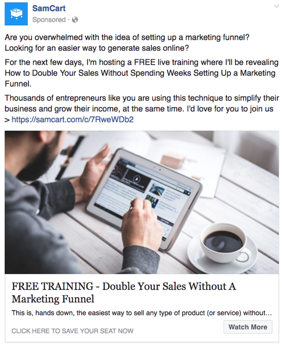
| That is SamCart. They have a number of different ads which I think really hit on the pain points of their potential avatar, as well as they really use good visuals in their ads themselves. They’re selling a webinar in their ad, or trying to convince people to convert on a webinar by hitting on pain points that maybe new Internet marketers, or maybe new digital marketers have, which is the complexity of setting up a sales funnel. This is something that’s really overwhelming to a lot of newbies who are just starting out in the industry. SamCart has a solution that really solves that, really simple solutions, elegant solution, which is their product SamCart. They use a webinar to sell that. I think it’s an automated webinar, but the ads I see are really good. I think the ad copywriting is really good.
|
|
| The copy they use in this ad is, “Are you overwhelmed with the idea of setting up a marketing funnel? Looking for an easier way to generate sales online?” Two questions to begin with, which I think are really good.
|
|
| Then the name of the online training is “How to Double Your Sales Without Spending Weeks Setting Up a Marketing Funnel,” overcoming a massive disadvantage. It’s that classic kind of, “You can do this without this really painful thing. Get this cool thing without this not cool thing.” I think the name of the training is really good. I like the image they use even though it’s a stock image. They put a bit of a tint on it, which we do, and we advocate doing that with stock photos.
|
|
| Sometimes stock photos just look like stock photos in the newsfeed. If you can use a tool like Canva, which has a way to tint your images so they don’t look quite so stock photo-y. Stock photos tend to repel people, and they just look like typical ads on Facebook.
|
|
| In their headline, they use all caps, which we advocate using all caps, but not overusing it. Their headline is, “FREE TRAINING.” They don’t say it’s a webinar; a lot of people might not know what a webinar is, really smart there. They say, “FREE TRAINING – Double Your Sales Without a Marketing Funnel,” which is something that’s really overwhelming to people just starting in the ads industry. This goes back to the idea of achieving a massive outcome while overcoming a massive disadvantage. They also use in the display URL, “Click here to save your seat now,” which I really like. Then, they use a call to action, which is “Watch more.” Overall, a really solid ad. I’m sure they get really good clicks and reasonably good conversions on it.
|
|
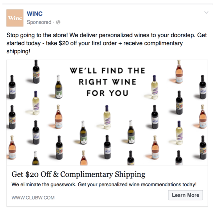
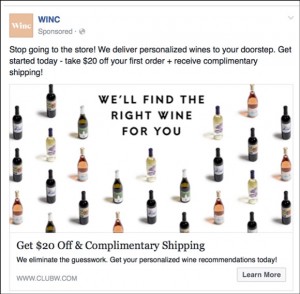
| The second ad I like is very different. This is actually from an e-commerce company. I see this on my newsfeed quite a bit. Maybe it’s because I’m one of their consumers as well. It’s Winc. Basically, they sell wine online.
They have a very simple, elegant image that has a bunch of bottles of wine, and then, in the middle of the image, they say, “We’ll find the right wine for you,” which I think is a really good tag line. Their top line is, “Stop going to the store!” All in lower caps, nothing really to Internet marketing here. Then, they go right into their promise: “We deliver personalized wines to your doorstep.” Really simple, easy, value statement. Then, “Get started today – take $20 off your first order + receive complimentary shipping!” Simple ad copy, not real long. With their headline, they reiterate their text copy, “Get 20% Off & Complimentary Shipping.”
|
|
| There are a couple things I like here. They use different symbols—they use the plus sign in the copy, which I think is really good, because, for whatever reason, those signs get better clicks through rates when you put it in your ad copy, I’m not sure why. They also use an ampersand their headline. Then, in their description they say, “We eliminate the guesswork. Get your personalized wine recommendations today!” It’s just an easy going ad; it’s the reason I like it. I’m sure it does well. It might not sell wine right off the bat, but it definitely prompts me to click, which is really the thing that you’re trying to do in the newsfeed. You’re not trying to sell the product quite yet, unless you have a video ad or something like that, but when you’re just using a straight link post ad, with a 1200×628 image, you’re just trying to sell the click, get them on the site.
|
|
| I really do like those guys, how they’re doing things. Winc uses the “learn more” call to action, as well, which I think is a little bit less intimidating than “sign up” or “buy now.” “Learn more” is the one that we tend to use the most.
|
|
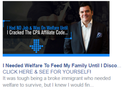
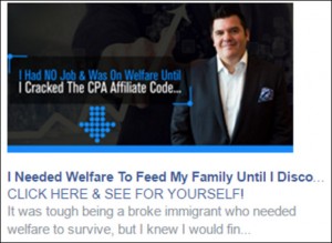
| The last one is the one that you definitely want to avoid. I’m not sure who this is exactly, but it’s unfortunate that they did not check how their headline ad copy appears in the right-hand column.
With right-hand column you have fewer characters, you have less space. Unfortunately for this guy, they said, “I needed welfare to feed my family until I…” the next word is “discovered,” but unfortunately in the right-hand column it says, “Until I dis…” Not exactly the message we want to have. “I needed welfare to feed my family until I started discoing” this is kind of the way I read it. We had a good chuckle about this in the agency of what not to do. That’s the reason we write ads specifically for the right-hand column.
|
|
| A lot of people forget about the right-hand column. Both Keith and I are big advocates for the right-hand column, not only for conversions and branding, but specially for retargeting. We find that right-hand column ads are really effective because they just hang there on your computer the whole cycle through. We always make a point to set up lots of right-hand column ads, especially for retargeting ads for smaller audiences, but we also test them right out of the gate with cold audiences, as well. Whatever you do, make sure you check your ad copy, how it looks previewed in the right-hand column before you set your ads live, so you don’t have this kind of embarrassing mistake going on. I’m sure they’ve got a great product, but this particular case just is something that you definitely do not want to do, it’s something to avoid.
|
|
| Those are my three choices for this week, I’ll talk to you soon.
|
|
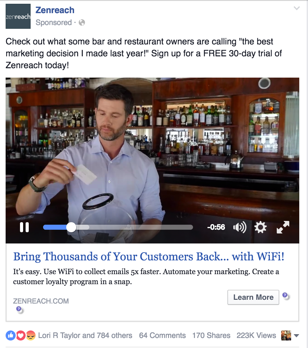
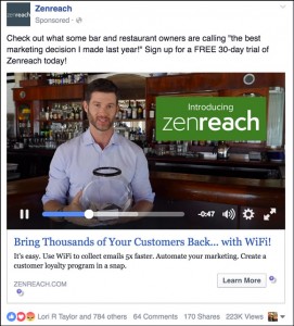
| Keith Krance: | Hey, Keith back here with you. I’m going to talk about one ad I really liked. I’m going to talk about what I like about it, and what I would suggest possibly testing out if I was running this campaign. This is a video ad by a company called Zenreach.
Here’s what it says: “Check out what some bar and restaurant owners are calling ‘the best marketing decision I made last year!’ Sign up for a FREE 30-day trial of Zenreach today!” Then it’s got a one-minute and nine-second video. At the beginning of the ad, the man in the video is talking and pulling out business cards out of a fish bowl. If you own a restaurant, a bar, or any business, really, you can see that frustration people have tried to use that and it just never really works, right? They collect all these business cards, but then they never follow-up with people, they never get their names in the system.
|
| Bellow the video, the headline is “Bring thousands of your customers back… with WiFi! It’s easy. Use WiFi to collect emails 5x faster. Automate your market. Create a customer loyalty program in a snap.” I’m going to play the video, then I’m going to talk about what it does. You can check this out at Zenreach.com, you can actually watch the video at their main website (or find it on YouTube here). I’m going to talk about how I would change the ad copy, what I like about the video, and how you can replicate this for your business, as well. Let’s play the video:
|
|
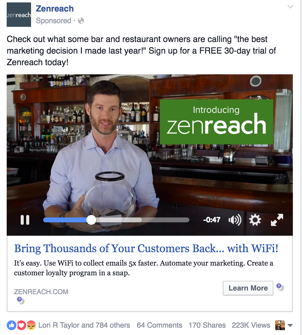
| Zenreah video: | “So you’re a bar or restaurant owner and you’re wondering, ‘How do I reach my customers? More importantly, how do I bring them back?’ Email marketing works, but how long are you going to live with this fish bowl? The truth is, having Rachel Potter’s card doesn’t tell you anything about who Rachel is and how you should connect with her. Introducing Zenreach; it’s the easiest way to turn new visitors into loyal customers. With Zenreach, your customers connect to WiFi by providing an email, which we automatically add to your database, complete with their gender, age, and visit history. When customers leave, Zenreach does the hard work of bringing them back.”
|
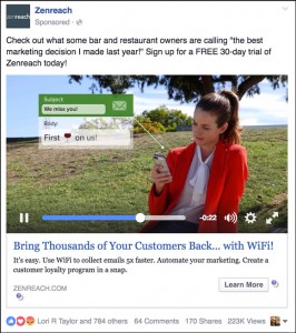
| Keith Krance: | There’s a little bit of humor, not a lot, they don’t show the scene long enough, I wish they did. They show a quick picture of people in a restaurant eating and drinking. Then there’s a little digital pop-up next to the people that shows how it looks like inside the system so you can really visualizes the real life experience, that challenge, but also the solution that this product provides.
|
| Zenreach video: | “With Zenreach, your customers connect to WiFi by providing an email, which we automatically ad to your database.”
|
| Keith Krance: | Here it does it really well of showing the product at work. Just shows one customer: Andrea, value: $25, visits: 1, female, 25-34, San Francisco, California, zero emails sent. It’s a picture of her, real life video, then, has a little pop up of showing that data.
|
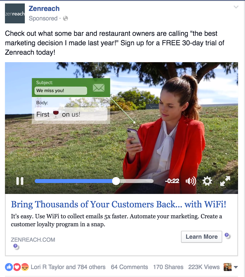
| Zenreach video: | “When customers leave, Zenreach does the hard work of bringing them back by sending automated emails to the right customer at the right time. We even know when your customer hasn’t visited in a while.”
|
| Keith Krance: | This is big. Now it’s showing a customer that’s out at a park, hanging out and looking at her phone and sees a text message or an email, “We miss you! First wine on us!” A picture of a glass of wine emoji and it just illustrates so well what this product does. It also helps the audience, the owner restaurant or business, to feel that frustration, they know.
|
| Zenreach video: | “The magic is in the analytics. Zenreach not only tells you how many people open an email, but we also measure your walk-through rate; your walk-through rate shows you how many people actually come back as a result of an email.”
|
| Keith Krance: | This is where he gives people an Aha! moment, I love that. Facebook is such a great way to make somebody aware of a problem or a solution they might not be aware of. It’s your job to make your audience aware, it’s your job to let them know. In this case, some people might not be paying attention to walk-through rate, and Zenreach is making them aware of how they need to be measuring the statistic, if they don’t know this, they’re losing a lot of people. This loyalty program app is the solution to solve that problem.
|
| Zenreach video: | “Grow your email list, automate your marketing and bring back more customers today.”
|
| Keith Krance: | “’Grow your email list, automate your marketing and bring back more customers,’” love it. It really tells the story well. I love the video. I know it’s doing really well for them; I don’t have specifics, though. But let’s talk about what I might do as far as changing up the ad copy. They might be doing this, I’m not sure. But if you go to their website you can see right above the fold, “Drive your walk-through rate with Zenreach. Customers who sign on Zenreach WiFi visit 65% more often than customers who don’t. Find out how.”
|
| I did a little digging on it, just basic Internet research, and it looks like 50% to 60% of customers don’t return after their first visit. This is general, this is people that are trying to sell loyalty programs. The one thing I don’t like about this ad copy is it goes right to the call to action too quickly. “Check out what some bar and restaurant owners are calling ‘the best marketing decision I made last year!’” I like that, too. Then it goes right to sign up for a free 30-day trial of Zenreach today. I don’t know if I like that coming in so quick. Instead, I can see them leading with the statistic, “Did you know that up to 60% restaurant customers do not return after their first visit? Watch the video to find how to get them back!” Or, “Watch the video to find out how to increase your customer walk-through by 65%,” or, “Click the link to learn more.”
|
|
| What we try to do with our Facebook ad copy, there’s a lot of different objectives we’re trying to achieve and there are different frameworks that you can use, but typically, we like to try to lead with something that either calls out to their attention or calls out a big frustration or challenge. I usually lead with something that’s attention getting, something that is a frustration, a challenge, or sometimes we lead with credibility, authority, kind of social proof. It just depends on your specific situation. In this case, they’re not really doing any of those. A little bit with—”the best marketing decision I made last year!”—but not really.
|
|
| That’s the only thing I don’t like to see. I’d rather them lead with something that makes them aware of a problem, which is the 60% of customers leave after their first visit or something that’s attention getting, something like that. That’s the one thing that I would do differently. They already have it on their website. If you go to their website, you can see what they do. You could use, “Increase your walk-through rate up to 65%.” I don’t know if I like using the phrase “walk-though rate” in the ad copy. If you know every single restaurant owner, bar owner, uses that phrase, “walk-through rate,” then use that. But maybe you just keep it more simple and talk about customers that don’t come back.
|
|
| That’s the one thing I would do: I would test out adding more to the ad copy itself and giving the audience a little tease of what they’re going to see in the video and then having a call to action. Although I love this video, it does it all. It leads with a challenge, makes them aware of that big frustration of people not coming back, and solutions that are wonky, like fishbowls and stuff like that, they just don’t work. But then it shows a customer at a park hanging out, and the pop-up trying to get that customer to come back. The video does a really good job of showing the software, the solution, in action.
|
|
| That’s my ad critique for today. Go to the show notes we will have screenshots of different phases of this video, and the other ads, in the show notes. Other than that, I hope this is really helpful, and I hope you enjoyed Ralph’s and Molly’s critiques. We will talk to you next week, bye-bye.
|
|
Thanks so much for joining us this week. Want to subscribe to Perpetual Traffic? Have some feedback you’d like to share? Connect with us on iTunes!
iTunes not your thing? Find us on Stitcher or at DigitalMarketer.com/podcast.